
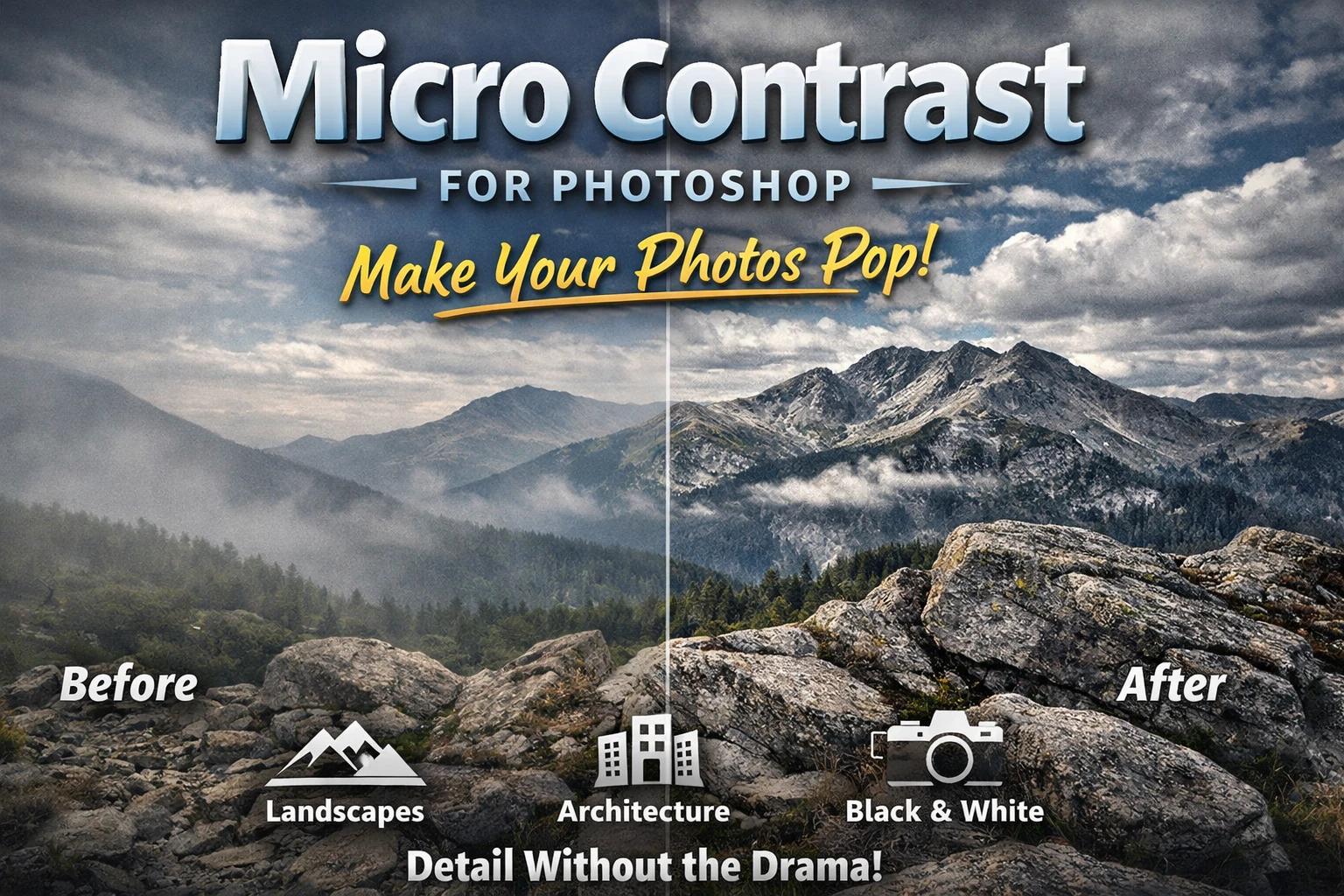
Micro Contrast for Photoshop: make your photos pop
If you’ve ever finished an edit and thought, “Nice… but it still feels a bit flat,” this is for you.
Micro Contrast is my little Photoshop plugin for adding that extra bite to an image — the kind where textures and fine detail start to feel more 3D — without turning the whole photo into an over-contrasty crunch-fest.
It’s especially handy for landscapes, architecture, and black & white work… basically anywhere you want detail and structure to come through.
You can grab the Micro Contrast Plugin Here
What it actually does (quick and simple)
Instead of pushing overall contrast (which can blow highlights, block shadows, and get ugly fast), Micro Contrast boosts local contrast — the small tonal differences that make things like:
- rocks
- tree bark
- clouds
- weathered buildings
- textured surfaces in general
…look sharper and more defined.
It’s like giving your image more presence, rather than just making it “more contrasty.”
How it works
I kept it straightforward:
- Pick a level: Low / Medium / High
- Then use the strength slider to fine-tune it
That’s it. No fiddly setup, no 18 confusing options.
My usual workflow: start on Low, nudge the slider up until I can feel the difference, then back off a touch.
When it looks best
Micro Contrast is at its best when there’s texture and structure to grab onto:
✅ Landscapes
Bring out detail in foreground rocks, foliage, mountains, clouds — the stuff that makes landscapes feel rich.
✅ Architecture
Stone, brick, concrete, wood — it loves that kind of surface detail.
✅ Black & White
Honestly, this is where it really shines. B&W lives and dies on tonal separation, and micro contrast helps everything feel clearer and more print-ready.
A couple of “don’t overdo it” tips
Micro contrast is powerful, so a little goes a long way:
- Skin/portraits: can make pores and lines jump out. Use Low, and consider masking if needed.
- Noisy shadows: it can make noise more obvious. Again: subtle settings, or apply selectively.
If you ever catch yourself thinking “oof, that’s crunchy,” just dial it back with the strength slider.
The lazy (but effective) way I use it
- Do your normal edit first (exposure/tones/curves/etc.)
- Run Micro Contrast on Low
- Increase strength until it feels “better”
- Back off slightly so it still looks natural
It’s one of those tools that’s best when people don’t notice it directly — they just think the photo looks better.